Veggie Hunter
Uncover Hidden Treasures and Help Save the Planet
Duration
5 months
Skills
UX/UI design
Interaction design
Illustration
User/usability testing
UX research
Research Methods
Interview
Survey
Affinity map
User/usability test
Tools
Figma
Adobe After Effect
Adobe Illustrator
Platform
Mobile
Web
Overview
Veggie Hunter is an innovative AR application that brings imperfect vegetables to life by transforming them into endearing characters. Users engage with the app by scanning unique markers on these veggies, which unlocks captivating stories and educational insights about each vegetable. This interaction not only enhances user experience but also promotes the purchase of often-overlooked produce, contributing to the reduction of food waste. Through its creative use of augmented reality, Veggie Hunter encourages a deeper appreciation of food diversity and sustainability.
Challenges
1
User Awareness
Educating consumers on food waste and imperfect produce
2
Technology Integration
Ensuring a user-friendly AR experience that encourages engagement
3
Content Creation
Crafting engaging stories and nutritional info for veggie characters
4
Market Adoption
Encouraging choices of unique or imperfect vegetables
Background
Veggie Hunter was inspired by the urgent issue of food waste and its environmental consequences. Recognizing that many unique vegetables are discarded due to their appearance, this project leverages AR technology to help users discover and appreciate these overlooked produce. By fostering sustainable consumption, Veggie Hunter aims to connect users with their food and encourage environmentally conscious choices.
Process
Discover
Investigate food waste and user behavior toward imperfect food
Define
Identify key user needs and project goals
Design
Develop the AR experience and interactions
Test
Prototype and refine based on user feedback
Research & Insights
Our research focused on understanding the impact of food waste and user perceptions of imperfect produce, aiming to identify opportunities to promote sustainable consumption.

We found that:

Define Target User
We first defined our target users before designing interviews and surveys to explore their behavior. This approach helped us identify key design opportunities and inform the direction of our research.

Interview & Survey
To understand user behaviors and habits, we conducted interviews with:
30
people
16-40
years old
7
days
In response to a question about the most important factors when buying vegetables, our target users indicated that color and appearance were paramount, showing a clear preference for aesthetics in vegetable selection.

An interesting point is that while almost 70% of people have seen ugly vegetables at the supermarket, but only 40% of them actually purchased them.

Affinity Map
We created an affinity map to categorize and group insights from our user interviews and survey responses. This process helped us identify common themes, user needs, and opportunities for improvement, which informed our design decisions.

Insights & Key Themes
From our user research, we identified several key insights that guided the design process. These insights were distilled into three main themes, which helped shape our approach to addressing user needs and behaviors.

Mixed Reality & Objects
We utilized mixed reality by allowing users to scan uniquely shaped vegetables, which then come to life as AR characters. This blend of the physical and digital worlds encourages users to engage with real-world objects in a fun and interactive way, bridging the gap between sustainability and technology.


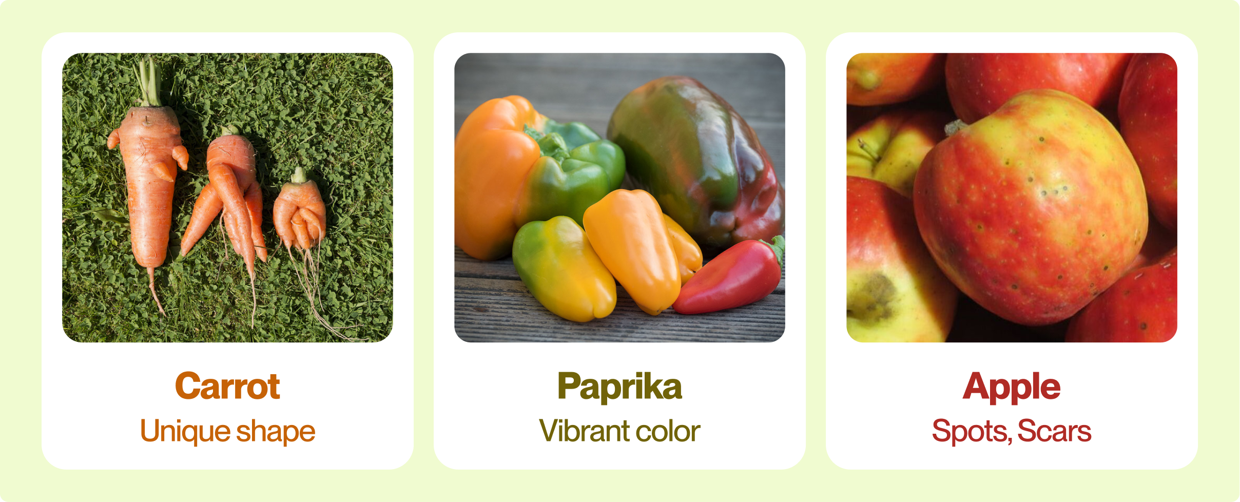
Among the various vegetables and fruits, we selected three items for the MVP: carrots, paprikas, and apples. Each was chosen for its unique characteristics. Carrots often have interesting shapes, paprikas come in a variety of colors, and apples frequently display spots or surface scars.
Persona
We created personas based on our target users to represent their goals, needs, and pain points. These personas helped guide our design decisions and ensure that we addressed real user concerns throughout the development process.

User Journey Map
The user journey map outlines the steps our users take when interacting with the Veggie Hunter app. By mapping out their experiences, we identified key touchpoints and areas for improvement, allowing us to enhance the overall user experience.

Ideation
During the ideation phase, we developed a mood board to capture the visual style, emotions, and overall aesthetic of Veggie Hunter. This helped guide the creative direction and ensured consistency in conveying the playful, eco-conscious, and tech-savvy nature of the project.

Design
Our design process involved several key stages to ensure a seamless and intuitive user experience. We started with mapping out the user flow, followed by constructing the information architecture to organize content logically. From there, we created wireframes to visualize the app's structure, leading to a clickable prototype for testing and iteration.
User Flow
We designed a clear and intuitive user flow to ensure that users can easily navigate the Veggie Hunter app, from scanning vegetables to collecting AR characters, making the overall experience seamless and engaging.

Information Architecture
Our information architecture was structured to organize content logically, enabling users to access key features effortlessly and maintain an efficient flow throughout their interactions with the app.

Wireframe
The wireframes provided a basic visual representation of the app's layout and functionality. These early designs helped us focus on structure and usability before refining the final look and feel.

Illustration
We transformed the selected fruits—carrot, paprika, and apple—into distinct illustrated characters, each with its own unique personality. These playful and engaging designs made the AR characters desirable for users to collect, turning everyday fruits into fun, interactive elements within the Veggie Hunter experience.

Prototype
During the prototype phase, we focused on developing the app’s core features. We broke down the core functionality into five key steps to ensure a smooth and efficient user experience. This approach allowed us to test and refine each feature, ensuring the app met both user expectations and project goals.


Step 1
Onboarding
Through a series of simple, illustrated instructions, users are guided through the app's core concept and main functions. The onboarding process introduces the idea of scanning vegetables, discovering and collecting AR characters, and sharing the decorated characters.
Step 2
Scan the veggie
When encountering vegetables with special stickers, users follow on-screen prompts to position the veggie in the center. Once scanned, a surprise appears—an AR veggie character! Dragging it into the virtual basket completes the collection.
.gif)

Step 3
Check My Basket
After collecting veggie characters, they appear in "My basket." As more characters are collected, the basket fills up with magical veggie friends!
Step 4
View profile and story
Tapping on a veggie character reveals its story—learning about its unique shape, growth journey, preferences, and even dish recommendations!


Step 5
Decorate and share
Users can also dress up their veggie characters by entering their "dressing room" and then share their uniquely styled characters with friends, inviting them to become veggie hunters too!
Official Website Design
The official website for Veggie Hunter was designed to provide users with an engaging and informative platform. It showcases the app's features, promotes sustainability, and offers resources for users to explore unique vegetables.

Design System
We developed a cohesive design system to ensure consistency across the Veggie Hunter app. This includes the foundation and components, creating a seamless user experience while maintaining the playful and eco-friendly tone of the project.

We also leveraged variables throughout the design system, allowing for greater flexibility and significantly speeding up the prototype development process. This approach enabled us to quickly adapt and refine elements without compromising consistency.
.gif)
Evaluation
Our design process involved several key stages to ensure a seamless and intuitive user experience. We started with mapping out the user flow, followed by constructing the information architecture to organize content logically. From there, we created wireframes to visualize the app's structure, leading to a clickable prototype for testing and iteration.
User Test
Participants explored the Veggie Hunter app and provided insights into their overall experience, including their reactions to the AR characters and the app’s features. This feedback helped us identify strengths and areas for improvement.


After using the app, participants showed increased interest in environmental issues and were more willing to buy unusual-looking vegetables. Both results were highly positive.


Usability Test
We used the SUS scale to evaluate the app's usability. The results indicated that Veggie Hunter performed very well in terms of learnability, efficiency, memorability, error handling, and user satisfaction.

Takeaway
Through this project, I learned valuable lessons, such as improving communication skills while collaborating with other designers and developers, strengthening my UX design abilities, including design system planning and research methods, and enhancing project management skills. There are areas for improvement, such as better prioritizing tasks and ensuring a clearer onboarding process with developers, so we can align our goals before starting collaboration. Overall, this experience has significantly enriched my skill set and prepared me for future challenges in design.

LET'S TALK!
Feel free to drop me an email or message :)
Copyright © 2024 Annie Hsu. All rights reserved.